Designing UX for Pod Tag notes
For Pod Tags, I started off designing the app with a user story:
As a user, I want to be able to take notes while listening to a podcast so that I can go back to it and review it later.
I then broke down the specific steps into the following:
-
Tap a button to open up the note taking tool
-
Create a note
-
Save note
-
See history of notes
With a clear and concise user story, I then dug into the specifics. Below are three options that I explored and my thought process behind what I liked and didn't like about them:
-
Separate note taking button
-
Screen-wide CTA with expanding dashboard
-
Pause button to trigger notes
Separate note taking button
One option I considered was separating the pause button from the note taking feature. The user could pause a podcast by tapping once but would need to tap a second button to take a note. This design also preserves the episode notes that is typical of podcast players. However it isn't immediately clear how the user can look up previous notes. Perhaps in the "podtags" library in the menu bar at the bottom or by tapping the "take note" button. Ultimately I thought the user would need to take too many extra steps and actions to hit the core moments of the user story.
Screen-wide CTA with expanding dashboard
I then considered a screen-wide CTA that expanded down to display their note history. The CTA was labeled "Pod Tags" which made it clear that this is where the user could find their notes for the episode. Once the dashboard expanded, the user could then tap another button to trigger the note taking tool.
This flow was closer to the mark for the user story and felt a lot more intuitive. It easily displayed note history for the podcast and the path to get to the note taking tool was clear. It also preserved the episode notes which I liked. However I still didn't enjoy that fact that the user had to take so many actions to get to the core user flow. The CTA also felt pretty invasive.
 Pause button to trigger notes
I decided to go back to the drawing board and looked at my mock-ups to see what parts of the designs fit the core user story and what parts didn't.
Episode notes were unessential
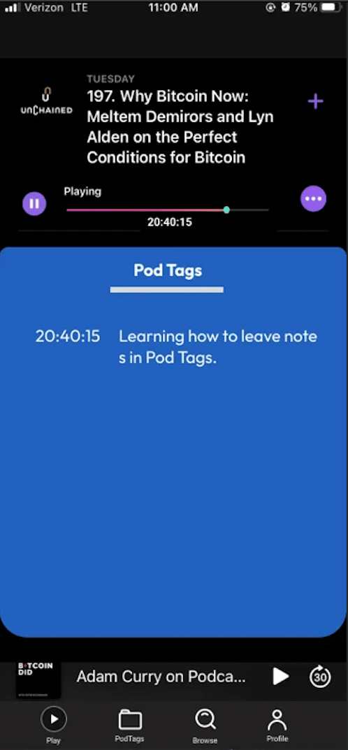
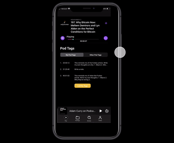
The first thing that I realized was that the episode notes weren't an essential part of the user story. So I scrapped that section and replaced it with the history of all the saved tags for the podcast. Now when someone clicked into a podcast episode, they'd immediately see a record of all the notes they've taken.
Pause button to take notes
To reduce the number of taps needed, I experimented with the idea of triggering the note taking tool with the pause button. I liked this approach because it natively embedded the note taking tool into the player. This made it very clear that the main purpose of this app is to take notes.
This UX decision also had one major assumption: the user will want to pause the podcast when writing a note.
One data point I had to justify this assumption was me! When I take notes while listening to a podcast, I always pause it. Why? To preserve the specific timestamp of the episode and so that I don't miss the next segment which could also be important.
This led to the final design, which you see below. Every time the pause button is tapped, the note taking tool immediately appears to the user along with a time stamp. To close the tool, it requires sliding the note down. This ensures that the user intends to save their note and prevents preemptive or accidental note saving. Finally if a note is closed without any text, then the note is not logged in the history section. This enables the user to pause a podcast temporarily but not save a note.
 Feedback
Do you think that presenting the note taking tool immediately after hitting pause makes sense? Could I improve on this design further? How might you have designed around this feature for pod tags?